| Sunday, November 12, 2006 |
| Basic Process 1 :: the Fireman |
Over the past few years, quite a few people have asked me about my process. I've also seen some terms used like "computer generated" or my personal favorite, "a monkey shellacking photos", so I decided to show a boiled down tutorial for my illustration process. I chose this illustration because it's a good, basic example of how I work. It's a simple portrait, with one central element and uses local colors. Regardless of how complicated any other piece may get, my procedure is based on this same process each time.
I generally start an illustration by doing ten to twenty thumbnails to work out the composition. Most of the time I'll have a fairly good idea of what the illustration will be but there have been plenty of times where I'll stumble across a little nugget that I would have never seen if I went straight in. Once I've worked out the composition, I gather my reference material. I have an ever expanding collection of costumes, props, etc. so I'll shoot my own photo reference whenever possible. I think it's ridiculous to try to pull details out of thin air or a quickly deteriorating memory like my own.
In the case of the fireman portrait, I let the photo reference guide the illustration. I was doing this illustration for the Society of Illustrator's Benefit for 911. I planned to base the illustration on the firemen throughout the rest of the country, the local guys that risk their lives on a daily basis that may not be getting their proper appreciation. I gathered my camera and sketchbook and headed off to the local fire department (number 14) but when I arrived there was no one around. As I was leaving I noticed a plume of smoke about a three miles away. Following the smoke I found 14 fighting a brush fire that had quickly spread and was threatening some buildings. After they had taken care of the job at hand I explained what I was doing and asked permission to take some photo reference. Trying to be as quick as possible since these guys were already exhausted, I snapped some photos of them. The last guy I shot was the one I ended up using, even though he wasn't the stereotypical fireman that I saw in my head.
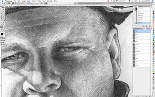
I always start my illustrations with a very detailed pencil rendering. From 3 or 4 of the reference shots I drew this piece in a 11X17 Strathmore sketchbook using a .3 mechanical pencil, woodless graphite pencil, and a kneaded eraser.

Once I've scanned in the pencil rendering in grayscale, I select the Gray channel, create a new layer, and fill the selection with black. This keeps my pencils on a separate layer with no white or halos.

At this point I start cutting paths for all the separate elements in the illustration. In this illustration I cut around 11 paths. I've cut as many as 50+ before in a single illustration. I cut paths for all hard edge selections, and for selections with soft edges, I'll create a mask and save that selection as a channel. This is a production stage that can pretty tedious but it's invaluable later on in the process. It keeps the illustration clean and all the elements easily selectable.

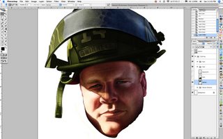
The next stage starts the coloring. After flatting a color layer under the pencil layer I start to "airbrush" the base colors. For the face I flatted a base skin color, added warm and cool areas, and started pulling out highlights and pushing back shadows.

I continue to "shape" the face by dodging and burning the skin tones. I then move on to the eyes on a separate layer behind the skin. Keeping the eyes on a different layer than the skin gives me the most flexibility on the delicate areas. If the eyes need tweaking it won't effect the rest of the face.

I repeat the same process for the different elements within the illustration. Most of the time when you work on individual elements on their own, they can tend to look like unnatural pieces of a puzzle when all the elements are combined. As I finish each section I'll blend the areas together that may have a bit too hard of an edge, or just may not fit together correctly.


Once the realistic elements are completely rendered I'll start with the design elements. I lay in a background color of fire engine red.

I then added vertical stripes that mimic the stripes on the flag or the structural elements of the world trade center. I also used a small shadow to pull the fireman slightly off the background and to give it more depth.

To finish it off I added the text along the top and also multiple line weights and opacities of strokes on the different design elements. After tweaking the colors here and there, it's finished. When working in photoshop there are a hundred different ways to get to the same result. This is a process that works for myself. Play around with it on your own and develop one that works best for you.

All in all I'm pleased with the portrait even to this day and I'm usually my worst critic. Well, except for that guy that called me "a monkey shellacking photos". I still plan on putting that on my business card! Below is the final piece.
 Labels: illustration |
posted by Tony Shasteen @ 10:36 AM  |
|
| 3 Comments: |
-
Tony, one day, can I grow up to be just like you?
EVAN-
-
You know it, just start drinking now!
-Tony
-
Hi Elizabeth,
I'm glad you found it helpful!
-Tony
|
| |
| << Home |
| |
|
|
|
|


Tony, one day, can I grow up to be just like you?
EVAN-