| Thursday, April 24, 2008 |
| Last Man Standing III :: Outbreak |

I recently submitted this piece for Concept.org's LMS3 competition. My time line was tight so I did quite a bit of it in the car on the way to Washington D.C. a couple weeks ago. I wanted to stay away from the obvious concepts like disease and zombies, so I chose the outbreak of lycanthropy (werewolf) and anger (shadow of approaching mob).
1. a sudden breaking out or occurrence; eruption: the outbreak of war.
2. a sudden and active manifestation: an outbreak of hives (or lycanthropy).
3. an outburst: an outbreak of temper.
4. an insurrection, revolt, or mutiny.
5. a public disturbance; riot.
From the early results coming in it doesn't look like I'll make it to the next round, but hey it was fun to illustrate regardless. |
posted by Tony Shasteen @ 2:58 PM  |
|
|
|
|
| Restroom Murders |

Ok, I did this illustration for Realms of Fantasy and it looks a lot more gruesome than it actually is. I can't say much about it without giving anything away. You really should pick up this magazine if you have the chance. Here's a little blurb that I pulled from...
“That’s why the fourth-floor ladies’ room is always locked,” Ashley informed her. “A data entry clerk whacked out and killed a bunch of people in it, and now they can’t get rid of the blood.”
Here are the thumbnails for approval. They're pretty rough, but you can see some of the other concepts. |
| posted by Tony Shasteen @ 7:43 AM |
|
|
|
| Sunday, April 20, 2008 |
| Leyendecker Exhibit :: Alabama |
 On Saturday I attended the traveling J.C. Leyendecker exhibit in Huntsville Alabama with my wife and friends Brian and Stine. I have literally been waiting over a year for this show, and due to a very busy couple months, I was forced into waiting until the last possible weekend. It was WELL worth the wait! On Saturday I attended the traveling J.C. Leyendecker exhibit in Huntsville Alabama with my wife and friends Brian and Stine. I have literally been waiting over a year for this show, and due to a very busy couple months, I was forced into waiting until the last possible weekend. It was WELL worth the wait!
Let's get one disappointment/apology out of the way early. I called ahead to make sure photography was allowed in the museum. I was told that it was allowed, but no flash photography. No problem, I have no need for a flash anyway. As soon as I entered, with my camera, I was told there was no photography in the Leyendecker exhibit... errrg. So the photos below are ones I happened to take while making "calls" with the phone. They don't look great, but they'll do. Click on the images for larger images.
I've seen a few pieces of his work in person here and there. But this traveling exhibition includes roughly 50 paintings, sketches, original magazine covers and advertisements from the collection of the Haggin Museum. I was able to see his work side by side, and occasionally in chronological order. It's great to see an artists progression over his career, but Leyendecker seemed to be an enigma. As much as he has a distinct style, he was also able to approach a very similar subject matter, as it was with the Kellogg's advertisements, in subtly different ways. And by having so much of his work in one place this was easier to notice.
 One thing I noticed with the Kellogg's pieces was how odd it was that there was no cereal in the bowels in the early works. There's no way I could get away with not painting the actual cereal in the bowl. I'm guessing he either did it because A) he didn't think it was needed, B) in working with the model, it was easier to not add the cereal to the bowl, or C) he wanted to draw the attention to the child rather than the product. I'm leaning towards C. You can sell more cereal with the look in a kids eyes than by looking at some unappetizing clumps O' corn and berries. One thing I noticed with the Kellogg's pieces was how odd it was that there was no cereal in the bowels in the early works. There's no way I could get away with not painting the actual cereal in the bowl. I'm guessing he either did it because A) he didn't think it was needed, B) in working with the model, it was easier to not add the cereal to the bowl, or C) he wanted to draw the attention to the child rather than the product. I'm leaning towards C. You can sell more cereal with the look in a kids eyes than by looking at some unappetizing clumps O' corn and berries.
 Next up was this piece, and there's the cereal! But something was odd, it didn't fit. Every stroke is planned from his hair, to the highlights, to the orange translucency in his back lit ear. It wasn't how he would paint cereal. It was messy and not thought out the way the rest of the painting was. Under closer inspection... sure enough, it was pasted in. Even Leyendecker had his work altered! This gave me a strange feeling of satisfaction. Not because he was pulling his hair out over the edit, but because even Leyendecker dealt with this sort of issue. It gave me an odd sense of... brotherhood. Next up was this piece, and there's the cereal! But something was odd, it didn't fit. Every stroke is planned from his hair, to the highlights, to the orange translucency in his back lit ear. It wasn't how he would paint cereal. It was messy and not thought out the way the rest of the painting was. Under closer inspection... sure enough, it was pasted in. Even Leyendecker had his work altered! This gave me a strange feeling of satisfaction. Not because he was pulling his hair out over the edit, but because even Leyendecker dealt with this sort of issue. It gave me an odd sense of... brotherhood.
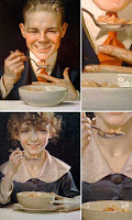  From that painting on he painted the cereal. AND, it was Leyendecker cereal! Trivial? Maybe, but it's a small glimpse into the artist, the way he worked, and what he dealt with. From that painting on he painted the cereal. AND, it was Leyendecker cereal! Trivial? Maybe, but it's a small glimpse into the artist, the way he worked, and what he dealt with.
 Seeing how Leyendecker worked fascinated me, and will be a theme here. Before this exhibit, for the most part, I only saw the final printed product. When you look at his work up close you see the edits, the thought process in getting it ready for production. He wasn't a fine artist, he was a commercial artist, and he was a designer. Take a look at this piece for Collier's. That's a well designed piece. It's balanced in composition and color. Notice how the red/orange "C" balances with the car. He makes it look so easy. Back to the designer in him, take a look at how he pulled the "s" in under the apostrophe. THAT people, is kerning! Seeing how Leyendecker worked fascinated me, and will be a theme here. Before this exhibit, for the most part, I only saw the final printed product. When you look at his work up close you see the edits, the thought process in getting it ready for production. He wasn't a fine artist, he was a commercial artist, and he was a designer. Take a look at this piece for Collier's. That's a well designed piece. It's balanced in composition and color. Notice how the red/orange "C" balances with the car. He makes it look so easy. Back to the designer in him, take a look at how he pulled the "s" in under the apostrophe. THAT people, is kerning!
 I could have spent hours on this illustration alone. It's a study in lighting, texture, and transparency. Also, notice the edited foot in the bottom of the painting that my friends caught. Possible blooming? I could have spent hours on this illustration alone. It's a study in lighting, texture, and transparency. Also, notice the edited foot in the bottom of the painting that my friends caught. Possible blooming?
 A couple things with this illustration for the Post. A) It's a class in itself to teach what you need to paint and what you don't. Just look at the shadows. B) I don't have the balls to obscure the guy's face in the background. A couple things with this illustration for the Post. A) It's a class in itself to teach what you need to paint and what you don't. Just look at the shadows. B) I don't have the balls to obscure the guy's face in the background.
 In this Halloween piece there's another example of using the type as an opportunity to balance the color and composition. The black "h", which was painted over the previous red version, balances the large black area made by the boy's clothes. Put your thumb over the "h"... doesn't work as well, does it? Was this a fix along the way, or intentional? In this Halloween piece there's another example of using the type as an opportunity to balance the color and composition. The black "h", which was painted over the previous red version, balances the large black area made by the boy's clothes. Put your thumb over the "h"... doesn't work as well, does it? Was this a fix along the way, or intentional?
 Leyendecker was a master at painting texture while maintaining his style. Compare the man's coat, suit, hat and tie. All different fabrics that he pulls off convincingly. Compare the woman's black dress to the apron. Even the skin of the mother and son are handled differently. Compare the mother's hair to the hair of the dog. In Rockwell's imagination everyone had the perfect family. In Leyendecker's world, there was never a humid day and everyone's hair was sculpted perfectly. Leyendecker was a master at painting texture while maintaining his style. Compare the man's coat, suit, hat and tie. All different fabrics that he pulls off convincingly. Compare the woman's black dress to the apron. Even the skin of the mother and son are handled differently. Compare the mother's hair to the hair of the dog. In Rockwell's imagination everyone had the perfect family. In Leyendecker's world, there was never a humid day and everyone's hair was sculpted perfectly.
 This illustration of the hunt blew me away on so many levels, but I'll spare you with only two comments on this piece. A) I couldn't convince anyone to let me paint a piece where the only eye contact you have be with the horse. But the horse is the hero of this illustration. B) Leyendecker designed horses better than God. This illustration of the hunt blew me away on so many levels, but I'll spare you with only two comments on this piece. A) I couldn't convince anyone to let me paint a piece where the only eye contact you have be with the horse. But the horse is the hero of this illustration. B) Leyendecker designed horses better than God.
 It's very obvious in the next few pieces that he had no interest in women whatsoever. In this depiction of Romeo and Juliet, where both characters usually share the stage, Juliet is decoration. She's a solid mass of color that blends into the background. It's very obvious in the next few pieces that he had no interest in women whatsoever. In this depiction of Romeo and Juliet, where both characters usually share the stage, Juliet is decoration. She's a solid mass of color that blends into the background.
 In this piece, entitled "Spring", the woman is decorative. She's a blooming flower, a butterfly, or a bird. She's anything but an object of desire. Was this a sign of the times or his personal preference coming through in his work? In this piece, entitled "Spring", the woman is decorative. She's a blooming flower, a butterfly, or a bird. She's anything but an object of desire. Was this a sign of the times or his personal preference coming through in his work?
Also, notice the construction lines in the type. The man was a typographer.
 Again with this piece, the woman is decorative and not the focal point of the illustration. As a side note, notice how he moved his signature. Was it too close to the trim line? It's interesting to see the compass marks on the final piece. Again with this piece, the woman is decorative and not the focal point of the illustration. As a side note, notice how he moved his signature. Was it too close to the trim line? It's interesting to see the compass marks on the final piece.
 Ok, this illustration goes completely against the "Leyendecker doesn't paint strong women" theory. You can feel the struggle in this woman's face. THIS is a strong woman. But then again, it's a strong, independent mother, not an object of desire. Ok, this illustration goes completely against the "Leyendecker doesn't paint strong women" theory. You can feel the struggle in this woman's face. THIS is a strong woman. But then again, it's a strong, independent mother, not an object of desire.
  The man could paint some babies. That is some pinch-able baby fat! The man could paint some babies. That is some pinch-able baby fat!
 For anyone wanting to study metal with minimal strokes, spend some time with this one. For anyone wanting to study metal with minimal strokes, spend some time with this one.
 I've always loved the simplicity and design of this Saint Valentine illustration. Notice the depth he gets between the hand in the foreground to the face. Follow the change in color from his shoulder to hand. I've always loved the simplicity and design of this Saint Valentine illustration. Notice the depth he gets between the hand in the foreground to the face. Follow the change in color from his shoulder to hand.
 Admiral Stark. This is probably my favorite piece of the show. It's strong and convincing. Also, in contrast to his cover and advertising pieces, it's more polished. There's a level of detail you don't see in all his work. Notice the type on the map. The countries and major cities are readable and the names of the towns are just illusions of type. But in contrast, his uniform is a massive column of blue. He knew this would hang on a wall to be admired. Admiral Stark. This is probably my favorite piece of the show. It's strong and convincing. Also, in contrast to his cover and advertising pieces, it's more polished. There's a level of detail you don't see in all his work. Notice the type on the map. The countries and major cities are readable and the names of the towns are just illusions of type. But in contrast, his uniform is a massive column of blue. He knew this would hang on a wall to be admired.
Overall there are a few reoccurring themes for me in the exhibit...
Level of Finishing :: It was interesting to see how often he let the raw canvas and construction lines show through. On the pieces that were commissioned strictly for reproduction, he did what was necessary and nothing more. If the white in the background was going to be blown out, why waste the paint covering it? He was practical and approached each illustration accordingly.
Strong Male presence and Mothering Women :: We all know his sexual orientation. I just never realized how much it came through is his work other than the obvious sports pieces and Arrow collar ads.
Typography and Design :: In this digital age, illustrators don't usually need to deal with typography, and for good reason. First, it's difficult. If the type can be added digitally, why do it? It can be argued that hand lettered type blends with the illustration better than digital type if not done correctly. You can be the judge if it's done correctly or not. Second, hand lettered type doesn't allow for change easily. These days you design the page to accommodate content and hope it's done correctly. Leyendecker was a designer and typographer. Type was used throughout his work even if it wasn't the focal point. Designers would learn as much from this exhibit as illustrators. It's also refreshing for myself, who spent a good portion of my career as a designer, to see a blending of both.
If at all possible, make time to see this exhibit. When you do, give yourself as much time as possible, and try to take a break in the middle to allow yourself to digest what you've seen. It can be a lot to take it.
Anyone interested in downloading the high res pictures can grab them here LeyendeckerExhibit.zip for the next 7 days.
     Labels: Leyendecker |
| posted by Tony Shasteen @ 7:30 PM |
|
|
|
| Thursday, April 17, 2008 |
| SiDEBAR's ACE Panel Audio: Digital Visions |
The guys at Sidebar did a nice podcast with Brian Stelfreeze, Jim Burns, Brandon Ragnar and myself at the recent ACE show in Atlanta. I'll be the one with the annoying nasally voice. Enjoy!
SiDEBAR's ACE Panel Audio: Digital Visions |
| posted by Tony Shasteen @ 2:14 PM |
|
|
|
| Tuesday, April 15, 2008 |
| Shadowrun :: Passkey |

From the Shadowrun manual... "Passkeys are physical modules ranging in size from a fingernail to a stylus or credit card. They use a combination of encryption and materials engineering to create a unique key that is plugged into a common commlink jack. If the correct passkey is not connected to a device that tries to access the node using this method, the access is denied. In addition to standard passkeys, more advanced passkeys have recently been developed. One of these passkeys is the nanotech passkey, in which a small colony of nanites form unique and dynamic patterns for authentication. These passkeys require a small amount of upkeep to sustain the nanomachines, which is usually accomplished by leaving the passkey plugged into a commlink for a few minutes each day." |
| posted by Tony Shasteen @ 10:30 AM |
|
|
|
|
| Shadowrun :: Matrix Entity Rating |

Like I mentioned a couple posts ago, I recently finished a run of black and white illustrations for Shadowrun. Here's one more of that batch.
From the manual... "The facility belongs to Aztechnology, so the gamemaster decides that their logo will be prominent in all nodes. To help counteract the claustrophobia of dome life, the VR sculpting is an outdoor area, complete with weather and fresh air, where users are allowed to fly. Controls for various subsystems are contained in trees, rocks, and other natural features."
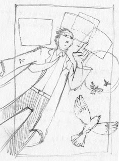
Here's the VERY rough concept sketch.
 |
| posted by Tony Shasteen @ 10:01 AM |
|
|
|
|
|


